
Imagine walking through your front door after a long, exhausting day. You drop your keys, take off your shoes, and step right into your living room. How does the space make you feel? Does it wrap you in a comforting embrace, or does it leave you feeling cold and uninspired? The secret to creating a space you truly love lies entirely in the shades you put on your walls.
In modern homes, the role of the living room has completely evolved. It is no longer just a formal sitting area reserved for guests. Today, it is your home office, your cinema, your sanctuary, and the ultimate gathering hub. Because we expect so much from this single space, finding the best colour for a house’s living room interior design has never been more crucial.
Choosing the right paint does much more than look pretty. A thoughtful palette physically transforms your living area into a welcoming sanctuary. It boosts your daily mood, drastically increases your home’s resale value, and showcases your unique personal style. In fact, color psychology plays a massive role in our daily lives. Looking at soft blue tones can actually reduce your stress levels by up to 20 percent. Color is a powerful tool.
Why Color Matters in Living Room Design
You might wonder why interior designers obsess so much over paint swatches. The truth is, color completely dictates how we perceive a physical space. It is a visual trick that can change the very architecture of your room without you ever having to lift a sledgehammer.
Let us break down how this works. Warm tones—like rich reds, soft oranges, and cozy yellows—actually pull the walls inward. They make a massive, cavernous room feel intimate and snug. On the other hand, cool colors—like breezy blues, gentle greens, and crisp lavenders—push the walls away. They make tiny, cramped areas feel open, airy, and expansive.
Beyond optical illusions, color psychology is an everyday reality. We naturally lean toward soft neutrals when we crave calm and mental clarity. Conversely, we turn to bold, vibrant hues to inject energy, passion, and lively conversation into our spaces.
This is exactly why choosing the best colour for a house’s living room interior design is a delicate balancing act. You need to marry practical functionality with beautiful aesthetics. A highly energetic color might look gorgeous on a Pinterest board. Still, it might keep you awake when you want to relax on the sofa.
When you select your interior color schemes, you must evaluate several specific factors:
- Natural Lighting: How much sunlight floods through your windows, and does it face north or south?
- Room Size: Are you trying to expand a small den or cozy up a grand hall?
- Existing Furniture: Do your current sofas, rugs, and artworks clash or harmonize with your new wall choice?
By keeping these everyday factors in mind, you ensure your room looks cohesive and feels incredibly comfortable.
Top Color Trends for Living Rooms
If you are wondering what the future holds for interior design, the 2026 forecasts are officially in. Right now, global design reports show a massive shift toward nature. Earthy neutrals are rising rapidly in popularity, deeply rooted in the concept of biophilic design. Biophilic design means connecting our indoor environments directly to the natural world outside.
What is driving these massive trend shifts? In the post-pandemic world, amid global shifts and lifestyle changes, we all crave wellness, safety, and sustainability. We want our homes to feel like healing retreats. We are moving away from sterile, hospital-like whites and cold grays, stepping warmly into colors that feel human and grounded.
Here are the major influences shaping our living room paint colors this year:
- Pantone Influences: Color experts are pushing for organic, rooted shades that promote mental well-being and visual comfort.
- Social Media Virality: Platforms like TikTok and Instagram are popularizing warm, moody aesthetics like “cottagecore” and “organic modern.”
- Eco-Friendly Paints: Consumers are demanding non-toxic, sustainable paint options. As a result, paint brands are releasing lines inspired by raw earth materials.
- Textural Depth: Flat walls are out. People want colors that mimic natural stone, clay, and soft plaster.
This return to nature makes perfect sense. We want to feel safe, grounded, and at peace the moment we sit on our living room couch.
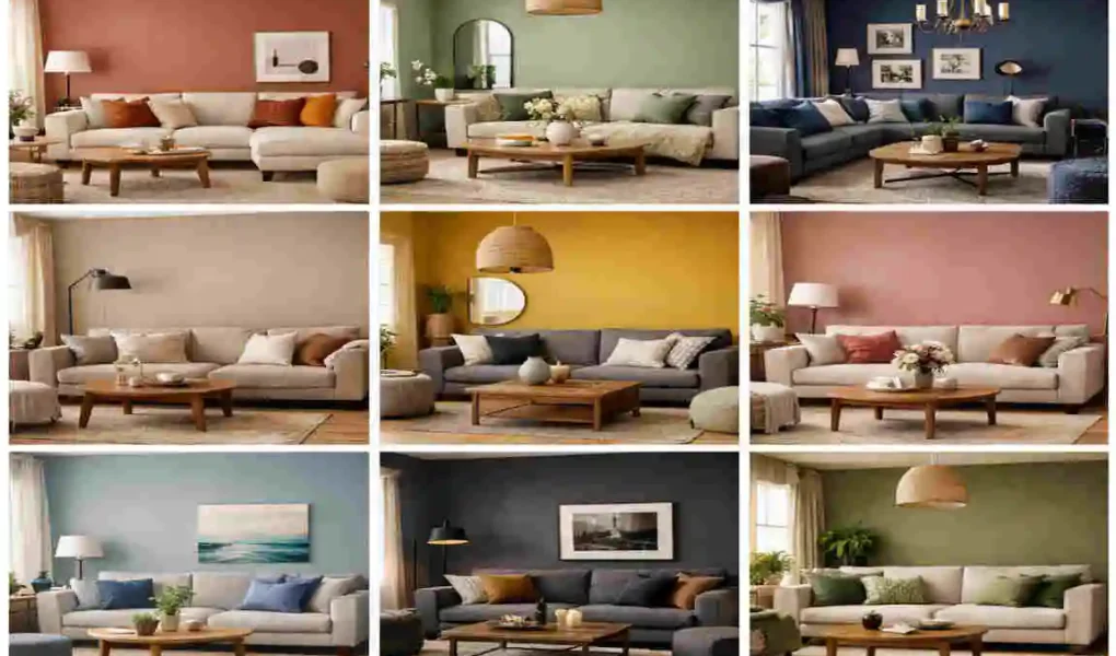
Timeless Warm Gray
For a long time, cool, icy grays dominated the interior design landscape. But in 2026, we have welcomed a much softer, highly inviting cousin: warm gray. Often lovingly referred to as “greige” (a perfect blend of gray and beige), this shade offers the ultimate middle ground.
The pros of using a warm gray are endless. It is incredibly versatile, meaning it plays nicely with almost any furniture style. Furthermore, its slightly darker undertone easily hides everyday wear and tear, making it a fantastic choice for busy households with kids and pets. Warm gray works best in small-to-medium-sized rooms that you want to feel modern without sacrificing coziness.
When it comes to pairings, warm gray is a dream. It looks exceptionally beautiful next to natural wood accents, woven rattan baskets, and vibrant, leafy houseplants.
Psychology and Mood
Warm gray is the ultimate grounding color. It feels exceptionally soothing to the human eye. It does not demand your attention, allowing your mind to rest naturally. It bridges the gap between classic elegance and relaxed modern living, giving your room a sophisticated, tailored atmosphere that never feels stuffy.
Real-Home Examples
Imagine a standard, builder-grade living room that currently feels sterile and boxy. By rolling a rich greige onto the walls, the space instantly transforms. Before, the room felt like a waiting area. After applying the warm gray, the space feels like a plush, upscale hotel lounge. The warmth of the paint beautifully highlights the grain of an oak coffee table. It makes a white linen sofa pop.
DIY Tips
If you are taking the weekend to paint this yourself, opt for high-quality, eco-friendly paint brands. Because warm grays shift significantly with lighting, always paint a large test patch first. Apply it in an eggshell or satin finish. These specific finishes reflect just enough light to keep the gray from looking muddy, and they are wonderfully easy to wipe clean with a damp cloth.
Soft Earthy Terracotta
If you want to inject literal warmth into your home, look no further than soft, earthy terracotta. Think of the beautiful, rustic appeal of baked clay pots sitting in a Mediterranean garden. This rusty orange-brown vibe completely transforms a standard room into a rich, inviting escape.
Terracotta is the absolute ideal choice for creating cozy vibes. In fact, many designers argue that it is the best colour for a house’s living room interior design if you are fully embracing current biophilic trends. It perfectly captures the essence of the earth. When styling this hue, pair it with creamy beiges, natural linens, and warm metals like brushed brass or antique copper.
Trend Backstory
Where did this color come from? Terracotta is currently riding the wave of the bohemian revival. But this is not the loud, neon orange of the 1970s. The 2026 version is muted, dusty, and highly sophisticated. It speaks to a global, well-traveled aesthetic. It tells a story of craftsmanship, artisan pottery, and a deep appreciation for raw, natural materials.
Room Transformations
Large, open-concept spaces absolutely shine with terracotta walls. Sometimes, massive living rooms with high ceilings can feel drafty and entirely uninviting. By wrapping the walls in a deep, rusty terracotta, you instantly pull the ceiling down visually and bring the walls inward. It creates a warm, sunset-like glow that makes massive rooms feel like intimate, fireside gathering spots. It is bold, yet wonderfully comforting.
Muted Sage Green
Step away from the hustle and bustle of city life and step into a serene forest. Muted sage green is a brilliant, nature-inspired pastel that brings the calming effects of the outdoors directly into your home.
The pros of choosing sage green are hard to ignore. It is deeply calming, highly restorative, and perfectly on-trend for the post-pandemic wellness movement. It serves as a visual breath of fresh air. Sage green is particularly effective in north-facing rooms. North-facing rooms often get cold, bluish natural light, and the gentle yellow undertones in a sage green perfectly counteract that chill.
To make this color truly sing, pair your sage green walls with rich creams, soft mustard yellows, and elegant gold light fixtures.
Styling Hacks
You do not have to paint the entire room to enjoy this hue. Sage green makes for a stunning accent wall behind your television or fireplace. Alternatively, try a technique called “color drenching.” Paint your baseboards, window trims, and interior doors the same sage green as your walls. This creates a seamless, highly custom look that screams high-end luxury.
Pro Designer Insights
Interior design experts cannot get enough of this shade. “Think of muted sage green as the absolute new neutral,” says top decorators. “It pairs with natural wood tones better than standard white ever could. It doesn’t fight with your furnishings; rather, it provides a lush, quiet backdrop that makes everything else in the room look highly curated and effortlessly expensive.”
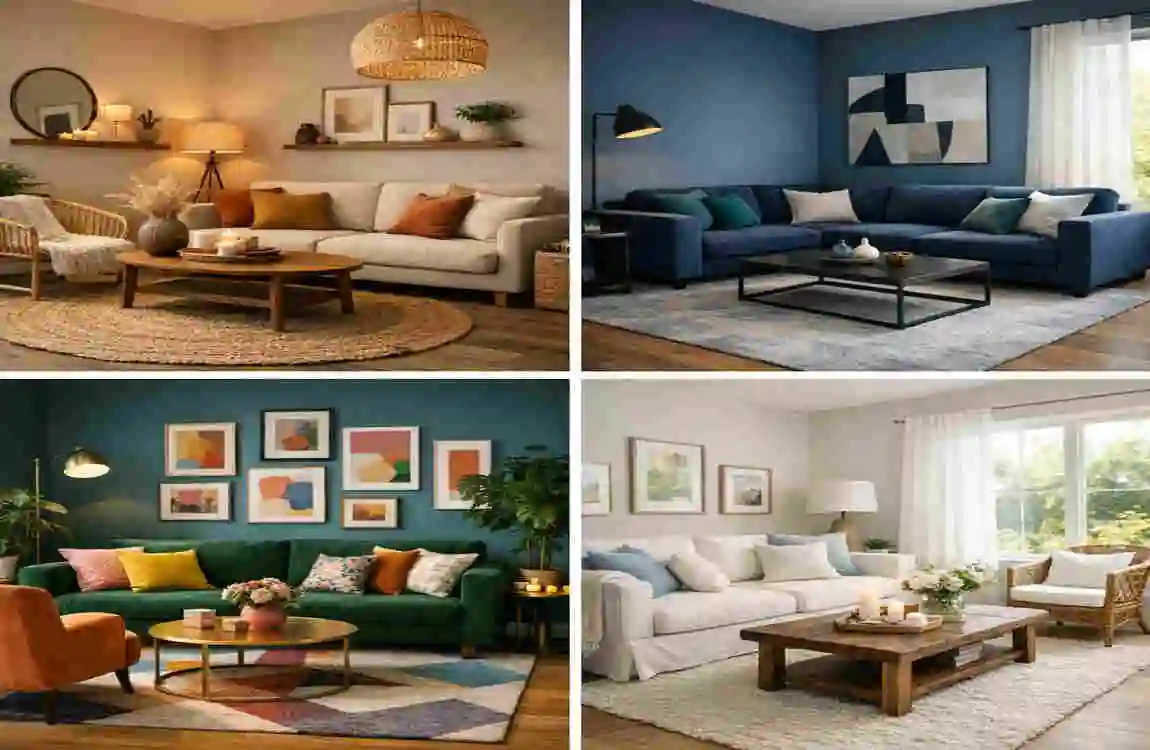
Warm Beige Neutrals
Forget everything you know about the flat, boring “builder beige” from the early 2000s. The 2026 warm beige is rich, creamy, and loaded with complex undertones. It acts as the ultimate versatile base layer for any design style.
If you are dipping your toes into home decoration, warm beige is arguably the best colour for a house’s living room interior design for beginners. It is incredibly forgiving. You cannot mess it up. It provides a warm, flattering glow that makes everyone sitting in the room look fantastic. Warm beige serves as a quiet stage, letting you easily swap out colorful throw pillows, bold rugs, and statement art whenever your mood changes.
For a stunning contrast, pair warm beige with navy blues, forest greens, or heavily patterned textiles.
Versatility Breakdown
The true magic of warm beige lies in its adaptability across a range of lighting conditions. In the bright morning sunlight, warm beige looks crisp, fresh, and slightly sandy. It feels like a sunny beach walk. However, as the sun sets and you turn on your soft table lamps, the beige deepens. It takes on a caramel-like warmth, wrapping the living room in a cozy, relaxing shadow. It is two completely different paint colors for the price of one.
Deep Navy Blue
Sometimes, the best way to make a space feel cozy is to lean into the dark. Deep navy blue acts as a sophisticated, dramatic anchor in a living room. It carries a heavy, luxurious visual weight that completely elevates the perceived value of your home.
The mood of navy blue is distinct: it evokes the feeling of serene, quiet evenings under a starlit sky. It is intellectual, calm, and deeply comforting. Deep navy is best utilized as a dramatic accent wall behind a lighter-colored sofa, or, for the brave, wrapped entirely around a room (including the ceiling) for a moody, jewel-box effect.
Luxury Pairings
Navy blue is the ultimate team player when it comes to high-end finishes. It creates a stunning, crisp contrast when paired with bright white crown molding and ceiling trim. To add immediate warmth and glamour, incorporate brass or brushed gold hardware, such as wall sconces, picture frames, and table legs. The metallic shine against the matte dark blue is simply breathtaking.
Common Mistakes
While beautiful, you must handle navy blue with care. The most common mistake homeowners make is over-darkening a room that lacks proper lighting. If you paint a small, windowless living room dark blue and only use one weak ceiling light, the space will feel like a gloomy cave. Always ensure you have multiple layers of lighting—floor lamps, table lamps, and natural light—before committing to a color this deep.
Blush Pink Accents
Pink has officially grown up. We are no longer talking about the bright, bubblegum shades found in a child’s bedroom. Today’s blush pink is subtle, dusty, and incredibly romantic. It brings a gentle, joyful flush of color to a room without ever feeling overwhelming.
Blush pink is currently trending heavily because it provides gender-neutral warmth. It is soft enough to act as a neutral backdrop. Still, it carries enough personality to keep a room from feeling boring. When styling this delicate hue, it pairs remarkably well with a range of shades of gray, stark charcoal, and creamy whites. The contrast between the hard gray and the soft pink creates a perfectly balanced aesthetic.
Forecast
Looking at the 2026 home trends, blush pink is rising rapidly, particularly in modern urban homes. City apartments can often feel rigid, full of concrete, steel, and sharp architectural angles. Urban dwellers are intentionally using blush pink on their living room walls to soften those hard edges. It brings a necessary touch of human warmth and gentle softness to the fast-paced, concrete jungle lifestyle.
Charcoal with Textures
If you are ready to make a bold, unforgettable statement, it is time to embrace charcoal. Charcoal gray is the ultimate choice for injecting intense drama and high-end sophistication into your living space.
Charcoal works brilliantly because it completely blurs the physical boundaries of a room. In low light, the corners of a charcoal room seem to vanish, creating an illusion of endless, shadowy depth. This moody characteristic makes it a strong contender for the best colour for house living room interior design in modern lofts and open-concept industrial spaces.
However, flat charcoal can sometimes feel dead. The secret is to incorporate a variety of textures. A matte charcoal wall absorbs light and has a velvety finish, making it the perfect backdrop for the room’s glossy, reflective surfaces.
Layering Guide
To make charcoal work perfectly, you must master the art of layering with lights and materials. First, install warm, ambient lighting. Cool LED bulbs will make charcoal look like a dreary parking garage; warm bulbs make it look like a high-end cigar lounge. Next, layer your furniture textures. Place a shiny, buttery caramel-leather sofa against the matte charcoal wall. Add a chunky, knitted wool throw blanket and a plush, high-pile rug. The extreme contrast in textures brings the dark walls completely to life.
Sunny Ochre Yellow
Sometimes, we need a little extra joy in our lives. Enter sunny ochre yellow. This is not a jarring, neon highlighter yellow. Ochre is a deep, earthy, mustard-toned hue that feels like captured golden hour sunlight.
The primary benefit of ochre yellow is its incredible ability to brighten dim rooms. If your living room faces a brick wall or receives very little natural sunlight, ochre acts as an artificial sun, bouncing a warm, cheerful glow around the space. It is an energizing pop of color that sparks creativity and lively conversation. For a highly modern, chic look, pair your ochre walls with stark matte blacks and crisp whites.
Mood Boost
There is actual science behind this color. Yellow is deeply tied to the psychology of joy, optimism, and high energy. When our eyes process yellow tones, our brains naturally release serotonin, the chemical responsible for happiness. By painting your living room walls ochre, you are designing a space formulated to boost your mood and chase away the winter blues.
Lavender Hues
In our fast-paced, highly connected world, finding a place to unplug is vital. Soft lavender hues are rapidly emerging as a top wellness pick for 2026 living rooms. This gentle, muted purple perfectly blends the calming stability of blue with the warm, comforting energy of pink.
Lavender creates a serene, spa-like retreat right in the middle of your home. It feels slightly unexpected for a living area, which makes it feel incredibly custom and highly designer-driven. It is quiet, delicate, and deeply soothing for the nervous system after a chaotic day.
Furniture Matches
You might wonder how to furnish a lavender room without it looking like a nursery. The key lies in embracing Scandi-style minimalism. Pair your soft purple walls with pale, blonde woods like ash or birch. Keep your furniture lines clean, modern, and uncluttered. Use natural, unbleached linens for your curtains and cushions. This combination elevates the lavender, making the space feel sophisticated, airy, and effortlessly chic.
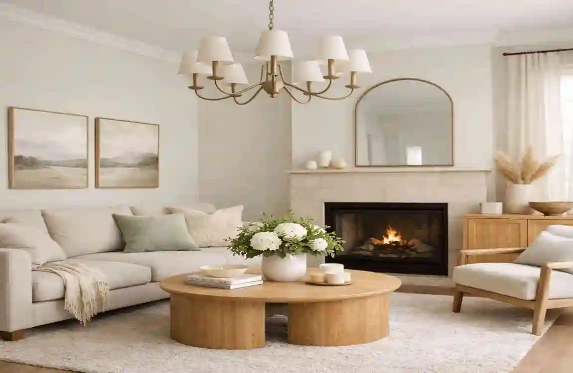
Creamy Off-White
We cannot talk about interior color schemes without honoring the timeless classic: creamy off-white. This is the ultimate fresh canvas. While trends come and go, a rich, warm white will always remain a top contender for the best colour for house living room interior design.
An off-white living room feels expansive, impeccably clean, and highly organized. Unlike stark hospital white, creamy off-white has tiny drops of yellow or brown mixed in. This ensures the room feels warm and welcoming rather than sterile and blinding. The absolute best part about off-white is that it pairs with absolutely everything. You can feature a bright red sofa, a massive gallery wall of colorful art, or a giant tropical houseplant—the off-white walls will proudly let those bold elements take center stage.
Maintenance Tips
Many homeowners avoid white walls because they fear dirt and smudges. The trick is to choose your paint finish wisely. Never use a “flat” or “matte” finish with off-white paint, as it will absorb dirt like a sponge. Instead, ask your paint store for a high-quality, stain-resistant “eggshell” or “satin” finish. These slightly glossy finishes create a hard, protective shell on your wall. When the dog shakes mud, or a child touches the wall with sticky fingers, you can simply wipe it completely clean with a gentle sponge and warm, soapy water.
Color Pairing and Scheme Ideas
Choosing your main wall color is only half the battle. To create a truly professional, cohesive look, you need a strong, balanced color scheme. You must consider how your primary wall color interacts with your accent colors (like your sofas, rugs, curtains, and artwork).
To help you visualize how these 2026 trends play together, we have put together a quick guide. Here are five stunning, fail-proof interior color schemes that you can easily replicate in your own home.
Scheme Primary Wall Color Accent Colors Best Room Size Overall Vibe
1 Timeless Warm Gray Muted Sage Green & Oak Wood Medium Cozy Modern, Grounded
2 Soft Terracotta Warm Beige & Brushed Brass Large Bohemian, Earthy, Intimate
3 Deep Navy Blue Creamy Off-White & Gold Large or Accent Wall Luxurious, Dramatic, Classic
4 Warm Beige Neutral Deep Navy & Charcoal Textures Any Size Traditional, Highly Versatile
5 Muted Sage Green Blush Pink & Pale Blonde Wood Small to Medium Calming, Wellness-Focused, Soft
Notice how each primary color in the table above is perfectly balanced by its accent? If you use a dark, heavy primary color like Navy Blue, you must lift the room with bright accents like Creamy Off-White. Conversely, if you use a very quiet, gentle color like Warm Beige, you can afford to anchor the room with heavy Charcoal textures. It is all about finding that perfect visual harmony.
Practical Implementation Guide
Now that you have hopefully found the best colour for house living room interior design for your personal taste, how do you actually bring it to life? Do not just run to the hardware store and buy five gallons unthinkingly! Follow this simple, step-by-step implementation guide to ensure flawless results.
- Test Large Swatches: Never trust a tiny paper paint chip. Colors look vastly different on a massive wall. Buy a small sample pot of your chosen color. Paint a large square (at least 2 feet by 2 feet) on a piece of thick poster board.
- Conduct Lighting Checks: Tape your painted poster board to the wall. Leave it there for 24 hours. Look at how the color changes in the bright morning light, the hazy afternoon sun, and under your artificial lamps at night. Make sure you love the color at all times of the day.
- Pro vs. DIY Check: Assess your room. If you have standard 8-foot ceilings and flat walls, grab some rollers, invite a friend over, and make it a fun DIY weekend project! However, if you have 20-foot vaulted ceilings, complex crown molding, or severe wall damage, it is highly recommended to budget for a professional painter. It saves you time and guarantees a flawless finish.
Quick Budget Planning List for DIY:
- High-Quality Paint (2 gallons for an average room): $100 – $160
- Primer (if changing from a dark to light color): $30 – $50
- Brushes, Rollers, and Drop Cloths: $40 – $60
- Painter’s Tape (Do not skip this!): $15
- Total DIY Estimated Cost: $185 – $285
Common Mistakes to Avoid
Even with the best intentions, interior painting projects can sometimes go wrong. To keep your living room looking like it belongs in a glossy magazine, avoid these common traps.
First, ignoring your natural light is the biggest mistake you can make. A color that looks beautiful in your friend’s bright, south-facing living room might look murky and depressing in your shadowed, north-facing room. Always test the paint in your specific environment first.
Second, beware of trend-chasing without personality. While it is incredibly fun to look at the 2026 home trends, do not paint your room terracotta just because the internet told you to. If you personally hate warm orange tones, you will be miserable in that room. Always filter current trends through the lens of your own personal taste. Your home should look like you, not a generic catalog.
Finally, never forget the ceiling! The ceiling is the “fifth wall” of your room. Leaving it stark, flat white can sometimes ruin the vibe of a richly painted room. Consider painting your ceiling a lighter shade of your wall color for a fully wrapped, cozy effect.
FAQs
You may still have a few lingering thoughts before you crack open a fresh can of paint. Let us answer some of the most common questions homeowners have when upgrading their spaces.
What is the best colour for a house’s living room interior design? There is no single “perfect” color for everyone, but if we had to pick the ultimate crowd-pleaser for 2026, it would be Warm Beige Neutral. It provides a flawless, timeless base that adapts to any lighting and lets you easily change your furniture and decor over the years without ever needing to repaint.
What colors make a small living room look bigger? To visually expand a tiny space, lean heavily into cool, light-reflecting tones. Muted Sage Green, Lavender Hues, and Creamy Off-White physically pull the walls back and bounce natural light around, making the room feel airy, open, and much larger than its actual square footage.
How can I update my living room color on a tight budget? You do not have to paint all four walls to make a massive impact. Choose a bold color, like Deep Navy Blue or Charcoal, and paint a single accent wall behind your television or sofa. One gallon of paint is highly affordable and can completely shift the energy of the entire room in a single afternoon.
Are dark colors a bad idea for living rooms? Not at all! Dark colors create unparalleled coziness and drama. The trick is to ensure you have adequate lighting (both natural windows and plenty of lamps) and to balance the dark walls with lighter furniture, bright rugs, and reflective metallic accents.